Creating signage that is inclusive and accessible isn’t just about slapping on a few braille dots or making text bigger. It’s about understanding the different ways people interact with the world and designing in a way that works for all. Whether you’re designing for a bustling city like Melbourne or a cozy local shop, accessible signage should be front and centre in your plan.
Why Accessible Signage Matters
Accessibility is not just a legal obligation—it’s a social responsibility. A well-designed sign can be the difference between someone finding their way or feeling lost. Think about it: signs are everywhere. From road signs to store directories, they guide us, inform us, and sometimes, even warn us. But if a sign is not designed with inclusivity in mind, it fails to fulfil its basic function.
Understanding Accessibility Needs
Different people have different needs when it comes to signage. Some may have visual impairments, others might struggle with hearing, and some individuals might face mobility challenges. There’s a broad spectrum of users to consider when designing signage. This means your signage should be readable, easily understood, and located in spots where everyone can access them.
Take into account font size, colour contrast, and lighting. High contrast between text and background is essential for legibility. For instance, a bold black font on a white background or bright LED signs can work wonders for readability, even in low-light conditions.
Choosing the Right Font
Fonts can be fun, but they can also be a headache if chosen poorly. The primary goal here is clarity. While decorative fonts may look fancy, they often sacrifice readability. Stick to sans-serif fonts such as Arial or Helvetica, which are easier on the eyes.
It’s not just about style, though. The size of the text is equally important. Small text won’t cut it. Aim for a font size that can be easily read from a reasonable distance. For example, signage in Melbourne’s bustling streets should be large enough for pedestrians to read without straining their eyes.
Contrast and Colour Choices
Contrast and colour play a significant role in making signs legible. Some colour combinations are more accessible than others. Think about those times when you’ve squinted at yellow text on a white background. Now imagine someone with a visual impairment trying to do the same. Spoiler: it won’t work.
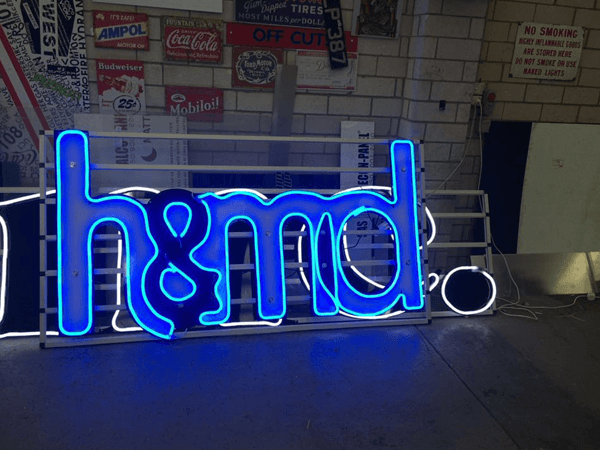
Stick to high-contrast colours. Black and white is the classic combination, but don’t be afraid to use bright, attention-grabbing colours. For LED signs, this becomes even more critical. LED signs are popular for their brightness, but overusing neon colours or clashing hues can be visually overwhelming. Choose your colours wisely.
Consideration for Different Sensory Needs
It’s not all about sight. Some people rely on tactile information. This is where braille signage comes in. Braille signs are a legal requirement in many places, and they’re invaluable for people with visual impairments. But simply adding braille isn’t enough. The placement of these signs is just as important. They should be placed at a height that is accessible to all users, and located in areas that make sense. For example, directories, restrooms, and elevators should all feature braille signage.
Another consideration is the inclusion of auditory or visual cues for those with hearing impairments. A simple way to integrate this is by pairing visual information with sound cues. Think about crosswalk signs that beep when it’s safe to cross. Little details like this make all the difference.
Placement: Location, Location, Location!
You’ve designed a beautiful, accessible sign. Now, where to put it? The best-designed sign won’t be of much use if it’s stuck in a corner where nobody can see it. Placement is crucial for accessibility. Signs should be at eye level and placed in well-lit areas.
For example, if you’re setting up signage in Melbourne, a city teeming with foot traffic, the signs should be easy to spot even in the most crowded areas. This is especially true for directional signs or emergency exits. If someone’s in a hurry, the sign needs to be easily visible and not obscured by other objects.
Using Technology to Enhance Accessibility
We live in a digital age, so why not use technology to make signage even more accessible? LED signs are a great way to integrate dynamic content that can be updated as needed. They’re bright, easy to read, and can even offer features like scrolling text for extra information. Plus, LED signs are energy-efficient, which is always a bonus.
There’s also the opportunity to incorporate QR codes, allowing users to access more information via their smartphones. This could be particularly useful in museums or galleries, where a simple scan can provide details about exhibits in various formats, from audio descriptions to larger text on screen.
The Role of Braille and Tactile Signage
Designing with braille and tactile elements goes beyond meeting legal requirements—it’s about truly considering every user. Tactile signs must be designed with raised letters alongside braille to help visually impaired individuals navigate spaces independently. The positioning and placement of these signs is essential. Placing tactile signs too high or in hard-to-reach places can negate their benefit.
Keep in mind that not all visually impaired people read Braille. Combining tactile elements with large, high-contrast fonts can serve a broader audience.
Involving the Community in the Design Process
Designing for inclusivity is not a one-person job. It’s a team effort, and sometimes, you need to ask the very people you’re designing for to get involved. Consulting with individuals who have disabilities can help you catch design flaws that you might otherwise overlook. Their real-world experience provides valuable insights into what truly works and what doesn’t.
Working with focus groups or advocacy organisations can provide feedback that’s not only insightful but practical. Their input could save you from making costly mistakes down the line.
Legal Requirements and Guidelines
While it’s important to go above and beyond in making signage accessible, there are also legal standards you need to follow. Many countries have established guidelines to make public spaces more accessible. In Australia, for example, the Disability Discrimination Act (DDA) sets out clear guidelines for accessible signage.
Following these regulations doesn’t have to feel restrictive. In fact, these guidelines serve as a strong foundation upon which creative and effective designs can be built. Always check local laws and standards to make sure your signage is compliant.
Conclusion
Designing accessible signage is not just about ticking a box. It’s about creating an inclusive environment where everyone, regardless of ability, can navigate with confidence. Whether you’re designing a directory for a mall or installing LED signs in a busy city like Melbourne, the goal is to make life easier for everyone who interacts with your signs. By focusing on clear communication, proper placement, and user engagement, you can make a world of difference—one sign at a time.
Remember, inclusivity is not a trend. It’s a necessity. Signage should work for everyone, and with the right approach, you can design signs that do exactly that.